Fix & Upgrade case study
The same business site, built twice
Van Wyk Panel Beaters is a fictional business created for this demonstration. The “before” site is a faithful recreation of patterns found on real legacy small-business websites; the site you're reading is the rebuild. Both are live, and both are measured the same way — the numbers below are the whole argument.
The audit
What we found in the legacy build — the same list we produce for every real Fix & Upgrade job:
- Photos uploaded straight from a camera — the largest is 5.1 MB for a single image, with no resizing, compression or modern formats.
- Built on Bootstrap 3 with jQuery 1.12 and an Owl Carousel slider — all render-blocking scripts and stylesheets loaded in the head.
- Ships html5shiv and respond.js, compatibility shims for Internet Explorer 8 — a browser retired in 2016 — to every visitor.
- Desktop-first fixed-width layout that breaks or requires pinch-zooming on phones, where most local searches happen.
- Missing meta descriptions, no structured data, and a broken heading hierarchy — search engines have to guess what the business does.
- Accessibility failures throughout: images without alt text, low-contrast grey body text, and tap targets too small to hit reliably.
What was done
The rebuild keeps the same content and photography — only the build quality changed.
Images resized and served properly
The same photographs, automatically resized for each screen and served in modern formats (AVIF/WebP). The 5.1 MB hero photo now arrives at a fraction of its original weight.
The 2015 plumbing removed
No jQuery, no Bootstrap, no IE8 shims, no slider plugin. The rebuild ships only the code it needs, and nothing render-blocking stands between the visitor and the page.
Mobile-first layout
Designed for the phone screen first and scaled up — because that's where customers actually are when they search for a panel beater after an accident.
Search engines given the full picture
Proper titles and meta descriptions on every page, LocalBusiness structured data, a sitemap, and a heading hierarchy that makes sense.
Accessibility built in
Alt text on every image, WCAG AA colour contrast, keyboard-visible focus states, labelled form fields and full-size tap targets.
Built to convert
Click-to-call and WhatsApp buttons within reach on every page, and a quote form that works — the things an actual customer needs from a panel beater's website.
The results
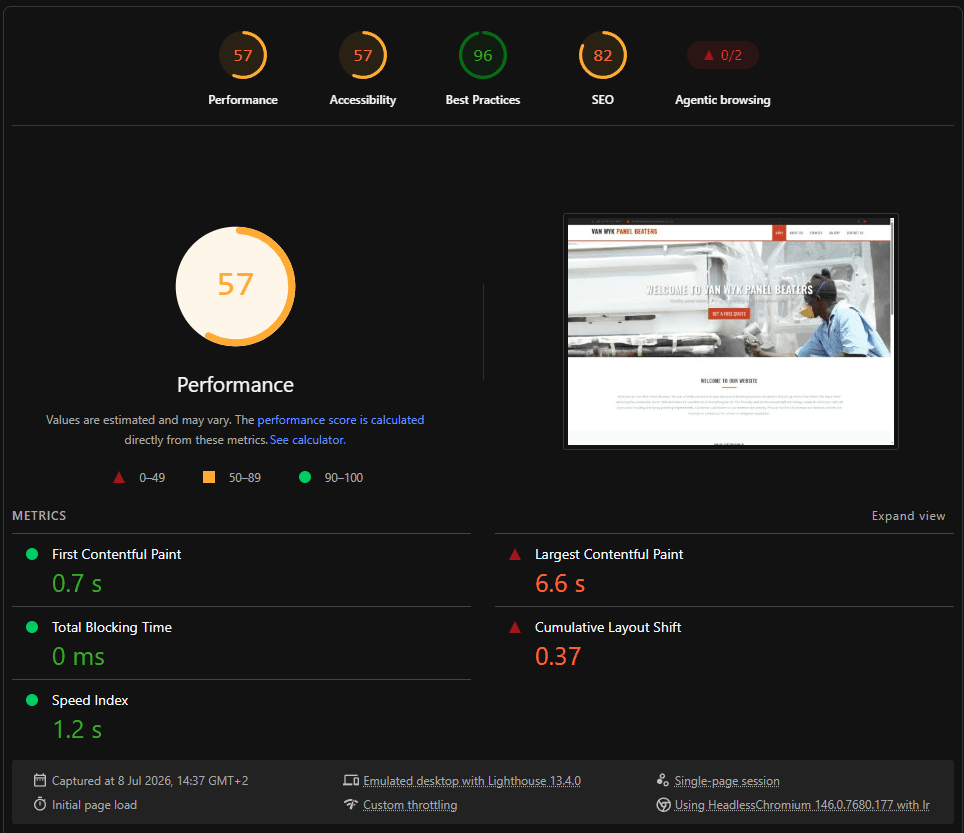
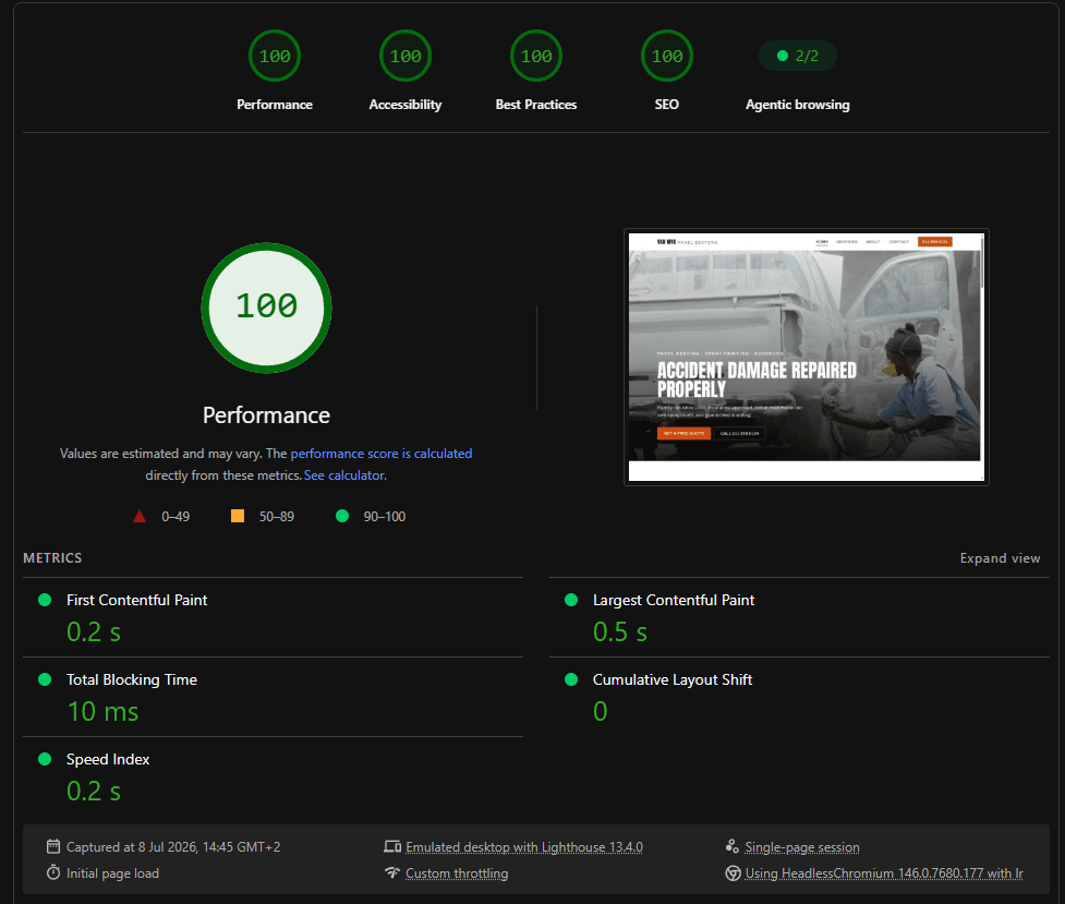
Methodology: both live home pages tested with Lighthouse 13.4 (emulated desktop, identical custom throttling) on the same day, and the numbers are reported unedited — including the one row the rebuild doesn't win.
| Metric | Before | After |
|---|---|---|
| Lighthouse Performance | 57 | 100 |
| Lighthouse Accessibility | 57 | 100 |
| Lighthouse Best Practices | 96 | 100 |
| Lighthouse SEO | 82 | 100 |
| Total page weight | 7,706 KB | — |
| Number of requests | 24 | — |
| First Contentful Paint (FCP) | 0.7 s | 0.2 s |
| Largest Contentful Paint (LCP) | 6.6 s | 0.5 s |
| Speed Index | 1.2 s | 0.2 s |
| Total Blocking Time (TBT) | 0 ms | 10 ms |
| Cumulative Layout Shift (CLS) | 0.37 | 0 |
The legacy site is live too — open the before site and feel the difference yourself on your own phone.
Recognise your own website in the “before”?
This is exactly what the Fix & Upgrade package does: same content, same photos, rebuilt properly — with the improvement measured and shown to you, not promised.
Get in touch